Yesterday I posted on the great features of SlideShare. Today I received this response on my Ning...
Googledocs is better as it is more collaborative and allows the easy use of Youtube videos. Slideshare is merely passable as you lose all music, animations and video. At that point you might as well output your ppt as jpegs and drop them into a java slideshow which is essentially what slideshare seems to do.
While this author makes a valid point about the collaborative nature of GoogleDocs and the ability to embed video and animations, he fails to miss the - get ready to LOL at this intended pun - point of the intended nature of my students' powerpoint.
Here was my response...
For the project I assigned above, my students were only allowed to use images and brief text to convey their idea. When you rethink the idea of a powerpoint what does a video, massive amounts of text and neat animations provide an audience anyway? If you are presenting it is YOU who is presenting the information, not the powerpoint. If you embed YouTube videos and animations then you might as well tell your students to create an imovie and let the students sit back and watch while the presenter joins in the viewing.
I want my students to be thorough with their research and knowledgeable presenters who can think on their feet and are well versed on what they are presenting. I alway show the first few minutes of Al Gore's movie, "An Inconvenient Truth" to help students understand what a good presentation looks like. The presentation should be the backdrop to the presenter not overly animated and visually distracting.
Nothing against Googledocs, but when you want students to PRESENT and not ENTERTAIN then have them use slideshare!
I'll leave you with this from a former colleague of mine who was helping students rethink and redesign powerpoint...
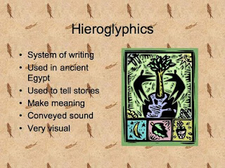
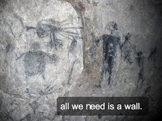
If your students are presenting on hieroglyphics, which slide looks better to as an audience member? Which slide intrigues you more? Which slide requires more presenter involvement and knowledge?

or...

When I am sitting back in the audience grading a presentation, I want to see slide #2! I have created - back in the days of primitive powerpoint (insert golf clap for alliteration! Teaching moment!) - and have sat through numerous presentations using slide #1 and it is torture to an audience member.
Two years ago our assistant principal gave a powerpoint presentation using a stoic white backdrop that was flanked by default black text. Despite numerous misspellings, the powerpoint was a flop. A flop in the vein of The Love Guru.
My point is that no matter what housing forum we use to share and embed our powerpoints, we need to understand that powerpoint is a tool for a presenter; it is not intended to replace the presenter. As teachers we must also employ this same method when presenting to our students. Many times we don't practice what we preach and torture our students with text laden powerpoints that go on for days.
The next time you create a powerpoint for your students, think about how it would feel to view the same powerpoint you just created. What effect will it have on learning? If you are just dictating notes via a powerpoint to usurp valuable class time, then simply give them a hand out or post the note filled powerpoint on your class wiki for students to view at home, take notes and then discuss the next day in class. This will surely save class time and your students will love you for it!
I'm not saying that SlideShare will change the way we present, but it gives us an option to display the powerpoints we want, while providing a central location for viewing and sharing them.
I hope this helps in your classroom and I always welcome feedback!


No comments:
Post a Comment